Whenever you try to access a web page that doesn’t exist on the web server you get a 404 error page. You’ve all seen the standard 404 “page not found” message a thousand times by now, and it gets old real fast.
So, wouldn’t it be nice if that error page was a little more entertaining, a little more informative, and just not so boring? The good thing is, the website creator can customize the error pages, so the road to creativity is wide open.
Of course not all website error pages need to (or should) be amusing, but they should be informative. They should suit the tone of the website, and making jokes may not be all that suitable for a bank website, for example. After all, the user has just encountered a problem.
That said, for many websites a little humor can work as an antidote to frustrated users. Put a smile on their faces instead of a frown.
Good examples of creative 404 pages
You can never go wrong with classical Star Wars:

Found at: http://crazybat.ca/nowhere.html
This one is dedicated to every math geek our there:
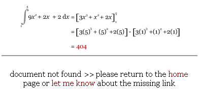
Found at: http://www.arbitraryconstant.co.uk/404.html
Retro charm in combination with pure denial:

Found at: http://thestumponline.com/poop
Why not try the classifieds?

Found at: http://www.limpfish.com/notfound.html
Get started!
Smashing Magazine recently rounded up a nice set of 404 pages and advice about creating good ones. Take a look and be inspired.
(Yes, we should have a good 404 page ourselves, but at the moment we don’t… We should follow our own advice and do something about this in the future. 🙂 )
