Microsoft is not the company that comes to mind when you think about great design. Apple, perhaps, but not Microsoft.
But that may be changing, which we discovered when we looked back over 30 years of hardware designs from Microsoft. Although it took Redmond quite a while to get up to speed, its designs are starting to look pretty cool.
1980 – the Z80 SoftCard
Even though Microsoft’s hardware group wasn’t formed until 1982, the first hardware from Microsoft was introduced in 1980.
The Z80 SoftCard was a co-processor card for the Apple II computer. With it, an Apple II could run software written for the CP/M OS, which, at the time, had a big library of software. Titles like WordStar and dBase were suddenly available to Apple II users.
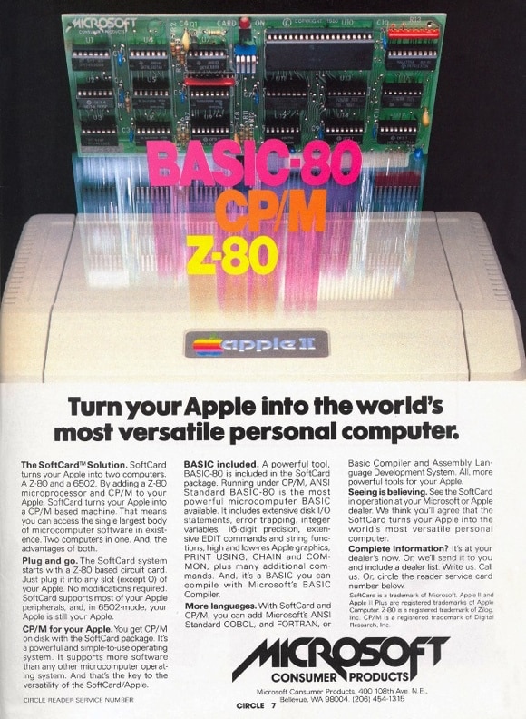
Picture courtesy of AppleLogic.org.
1983 – The Microsoft Mouse
The movie War Games premiered in 1983 as did Microsoft’s first mouse. “Microsoft, the people who set the standard for software, have done it again with the Microsoft Mouse,” read the ad for the Microsoft Mouse.
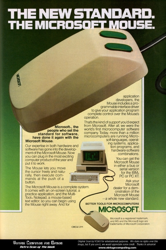
Picture courtesy of VintageComputing.com.
Looking at the first Microsoft Mouse today, we doubt many of you will feel that it was an example of great design. But put it against the first Apple mouse, and suddenly it doesn’t look so bad.
1994 – Microsoft Natural keyboard
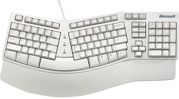
Although it was not the first ergonomic keyboard, it was the first that was widely available and reasonably priced. In 1994, Microsoft unleashed the Natural Keyboard onto the world, and wrists everywhere breathed a sigh of relief.
1996 – Scroll wheel
Two years later, in 1996, Microsoft took another big step in hardware design and added the scroll wheel to its mouse. It’s safe to say that the computer mouse has not been the same since, whether it has “Microsoft” stamped on it or not.

Picture from U.S. Patent 5,912,661.
1999 – Optical mouse
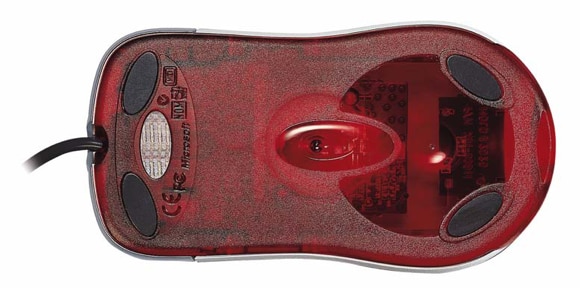
Still focused more on functionality than great looks, Microsoft released the first commercial optical mouse at the end of the century. This made the input devices not just more accurate, but made them easier to clean, as well.
2001 – Xbox
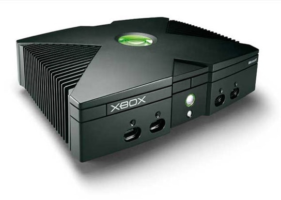
Some people feel the original Xbox still is much better looking than the later 360 versions, and many of us as Pingdom would agree with that. The big and bold “X” featured heavily in all promotional material, and the design of the unit itself was rather striking.
2005 – Xbox 360
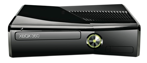
The follow-up to the Xbox from 2001 came in 2005 (isn’t it time Microsoft releases a new one?) It has iterated numerous times since then, with different models and designs.
2006 – Microsoft Zune
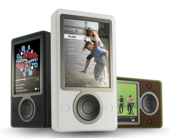
The Zune digital media player was introduced in 2006, and the whole line was killed off in 2011. We think the first models may not have been that inspiring in terms of the design, but later models, like the Zune HD, matched the competition well in that department.
But why there was a Zune in chocolate brown color we never understood.
2006 – Vista Industrial Design Toolkit
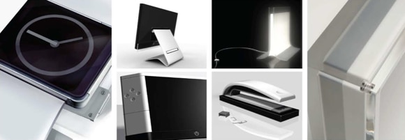
Who would have thought the words “Vista” and design would go well together, other than with “bad” thrown in there. In 2006, before it introduced Windows Vista, Microsoft released the “Vista Industrial Design Toolkit.” The job of creating the toolkit went to BMW Group Designworks USA, and its remit was to provide “PC designers with guidelines for creating hardware that visually connects with the Windows Vista software experience.”
Some of the design concepts it came up with look pretty cool. We just wish more of them made it into the market as shipping products. Not that it would have done much to improve the mostly miserable Windows Vista experience much.
Strictly speaking, this is not Microsoft hardware design, but we included it anyway because it shows what could have been.
2007 – The first LifeCam webcam
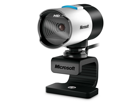
The first LifeCam was introduced in 2006 and it wasn’t much to look at. However, the current models are quite stunning, like the LifeCam studio you can see above. Clever use of different materials for feeling, look, and functionality, as well as striking lines and shapes. Who knew a webcam could look so good?
2008 – Microsoft Courier
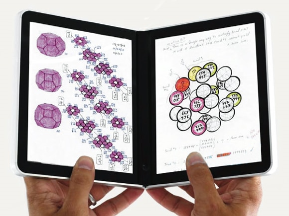
The Courier was a Booklet that Microsoft started to develop but later cancelled. It would have featured dual-touchscreens in a fold-up fashion as well as dual cameras. Considering that it was supposedly in development 2008-2010, it would be interesting to find out what effect, if any, the introduction of Apple’s iPad in early 2010 had on the Courier project.
2010 – Microsoft Kin
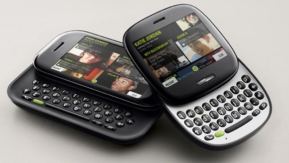
The Kin was another ill-fated hardware project from Microsoft, which, like the Courier, had some pretty exciting design aspects to it. In contrast to the Courier, the Kin actually made it to market, but it was pulled after about two months due to poor sales.
2010 – Kinect
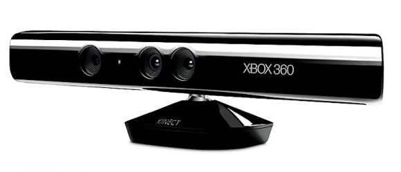
The functionality of the Kinect may seem like magic but the design? Perhaps not so much.
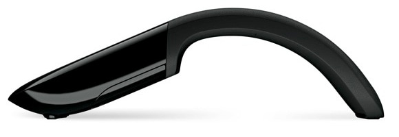
2010 – Arc Touch mouse
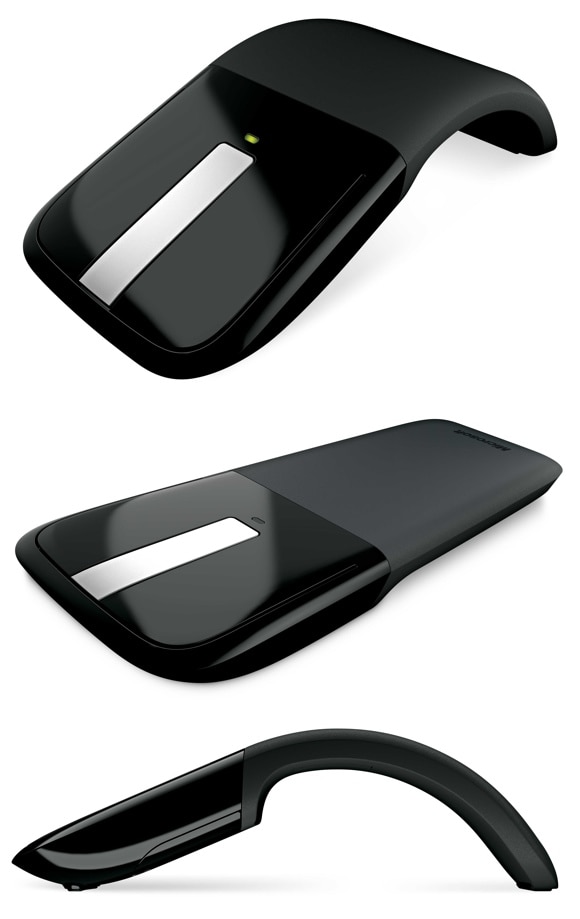
In recent years, Microsoft seems to have started to combine cool looks with practicality and usability. The Arc Touch Mouse is a great example of this. It not only looks fantastic, it also has some very innovative and clever solutions when it comes to functionality.
Metro
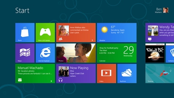
The pinnacle of Microsoft design may not be any piece of hardware it has ever put together, but the latest software it will introduce later this year: the Metro interface in Windows 8.
You may have noticed that we didn’t put a year next to Metro above, and that’s deliberate. At least some of the guidelines in Metro really saw the light of day in Microsoft’s Media Center as well as the Zune many years ago. Then in 2010 Windows Phone arrived, with Metro, but we think it’ll be with Windows 8, coming later this year, that Metro will be seen and used for the first time by most users.
After all, Metro has been described as “a design revolution at Microsoft.”
Best Microsoft design yet to come?
Even though Microsoft has created some stunning hardware designs it is as a software company it is best known.
There’s probably more Microsoft hardware, which we missed to include in this list.
What hardware can you think of that Microsoft has designed – cool looking or not – that we should have included?
