 Today Netcraft released its web server survey for July 2012, and we know many of you hurried to read how things have developed since last month (as did we).
What we’ve done is collect Netcraft’s data going back to 2003 and put that in one spreadsheet, which makes it easier to see how things have developed over the last 9 years or so. You can see the rise of NGINX, the fall of a few servers, as well as the continued domination of Apache.
Remember http://png.dm/netcraftchart. That’s the URL for a Google Doc you can come back to each month. As soon as there are new numbers out from Netcraft, we’ll add them to the document. You can see the numbers as well as the chart, which currently looks like this:
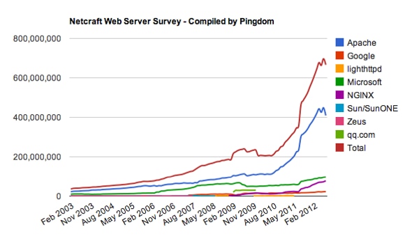
Note that the information in the spreadsheet is what Netcraft calls “Total Sites Across All Domains”.
We hope you will find this useful.
Image (top) via Shutterstock.
