We had the pleasure of attending this year’s From Business to Buttons conference in Stockholm and, as always, the speakers were second to none. From AirBnb’s Katie Dill talking about how good User Experience starts well before a user actually starts engaging with a product, to Mike Monteiro being, well, himself and telling it like it really is.
Like last year, we went home with heads full of new insights into how to approach the way we design and work. But rather than talk you ear off, we thought we’d share the 5 most important things we took home from FBTB17…
1. Happiness = Reality – Expectations
Happiness in this sense means the satisfaction your customers, visitors or users get when interacting with your product. It seems pretty obvious, right? Yet we often fall into the mindset that UX happens when a user starts interacting with your product, whether it be an app or a t-shirt. Except, as Katie Dill explains, great user experience starts well before the customer gets their hands on what you have to offer. User experience is not only pixels on a screen.
“UX follows the end user through the entire experience, both online and offline.”
Creating a coherent experience through the entire journey is important and never lose sight of the big picture. Using Virgin Airlines as her example, Dill highlighted how the company starts laying the foundations for a good experience with their customers long before they set foot on one of their planes. The language and imagery they employ set an upbeat tone for their product.
Despite no extra leg room and the same airplane seats as everybody else, Virgin begin to influence their user’s experience long before they fly. That way, by the time their passengers board, they’ll be expecting to party!
In short, if you know your end-user’s journey, get ahead and design for those occasions. Control what you can to create happiness.
2. Your ideal use case scenario is not the only use case scenario
Good user interaction design involves a level of empathy for your potential users, says Eric A. Meyer. Hopefully, at some point in your design process, you’ve identified who your target user is and how your product can serve their needs.
“You shouldn’t assume that you know who you are designing for.”
When designing a product, always ask yourself what you are assuming about your end-user and strive to design products that are more humane.
If you’re building a product that is designed for one-armed operation, you might have identified amputees as your end-users. What you might not have considered is that your product might also be really useful for nursing mothers, who might only have one hand free.
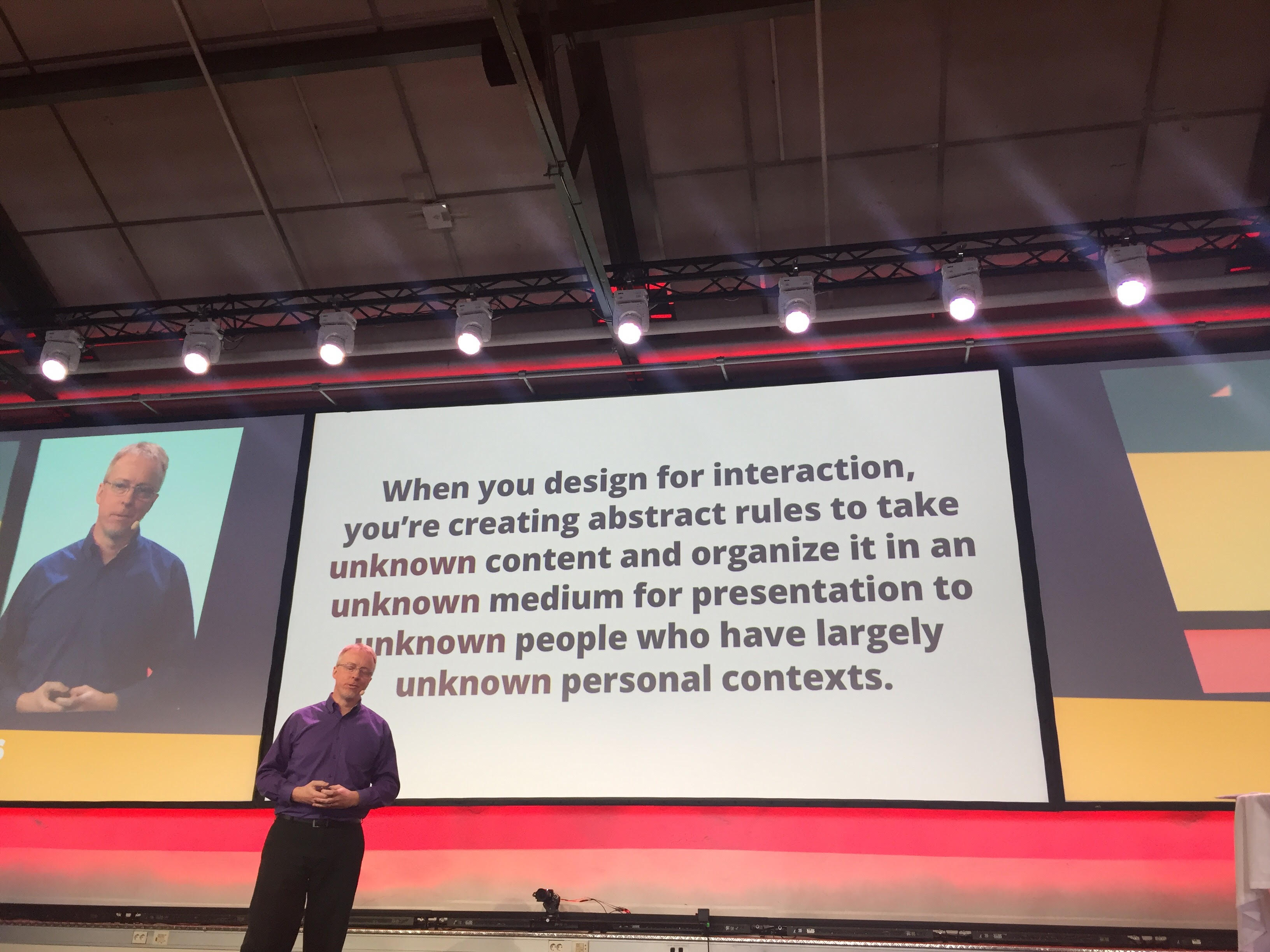
Humane design means making your product adaptable to as many potential and unknown end users, rather than expecting your users to adapt to your product.
3. Context is everything
The context in which you design a product will affect the end result. The context in which you design it to be used will also affect the end result, says Danielle Ehrlich.
Ehrlich uses a technique called active listening during her workshops to bridge the gaps between people from different cultures, backgrounds and languages.
“Successful products are made from the joint efforts of producers and users.”
Active listening is about learning and understanding who your end users are, where they come from and how their experiences have shaped them. Essentially, don’t build a product that you think your users want. Let your users tell you what they want in a product, and pay attention when they do.
4. Work backwards
Working backwards is Alan Cooper’s favourite way to work. Rather than asking yourself what you can design, or how you should do it, ask yourself why you should design it.
“Pretend design is magic: that everything is possible and there are no boundaries.”
When approaching product design, think about, if anything was possible, what it would like and how it would function. Then start working backwards. By assuming this approach, you make yourself a lot more adaptable rather than adapting the end product to foreseen limitations.
5. Design is always political
I’ve saved my favourite for last: Mike Monteiro on how designers are the gatekeepers of ethics. Mike is probably the most outspoken man in design today and instructs us, as designers, developers and businesspeople to behave with agency.
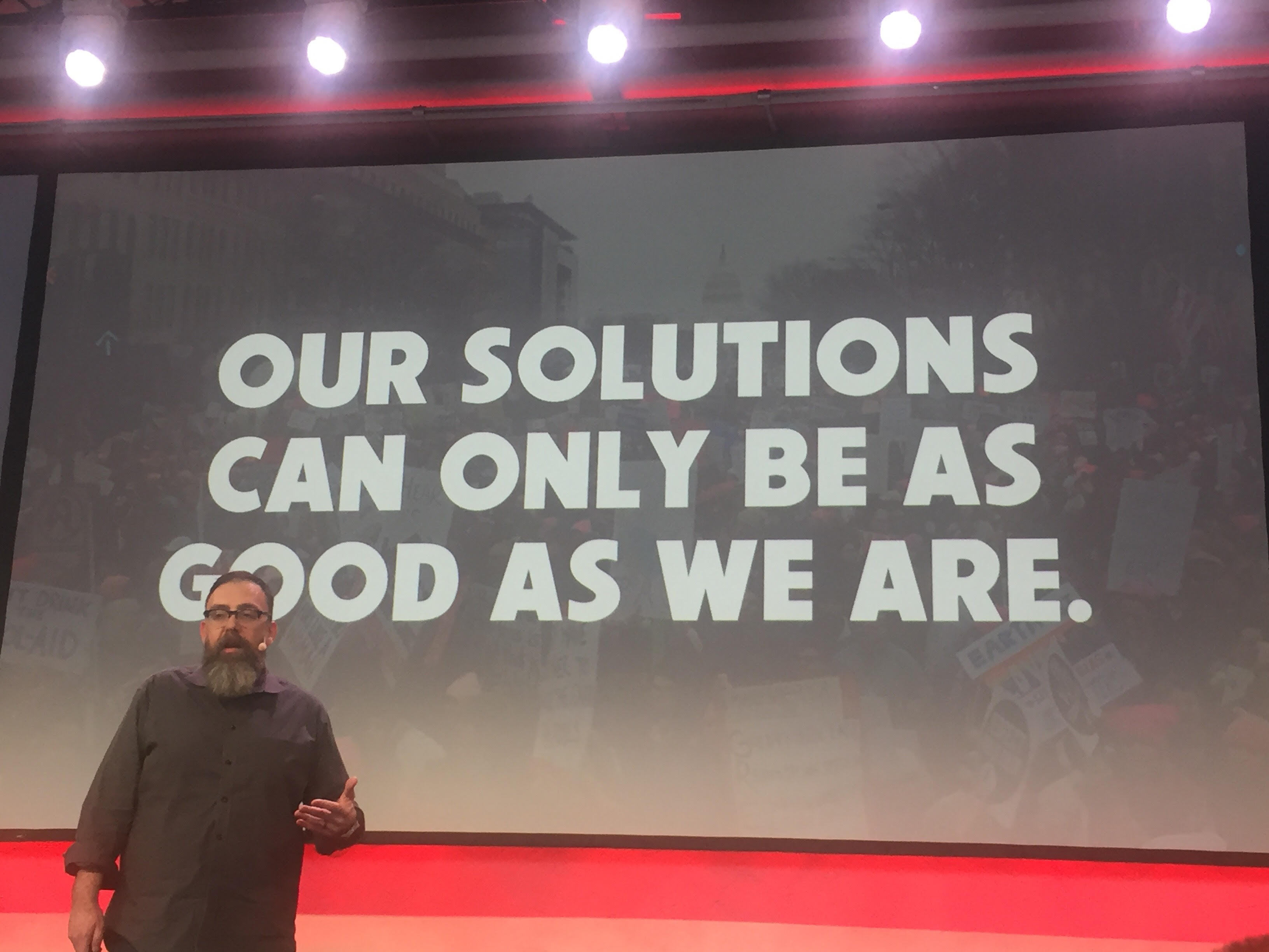
He argues that design is always political, and used the example of gerrymandering voting districts to influence a specific outcome. After all, what are voting districts if not human designed geography?
“Design is solving a problem within a specific set of constraints.”
As a designer, make sure that you take ownership for the things that you create. Question every single decision you make as a designer and ask yourself “if I design this, will it be used to hurt people?” Monteiro has a point: design is much more that just the look and function of the latest iPhone. Think of any dark moment in history: the chances are that it was designed into being by us, whether by conscious decision or not. In short, always remind yourself to design responsibly.
Will we see you next year?
Every year we attend we take home with us great new insights so we’ll be definitely be returning next year. If user experience matters to you, or you would like to approach your design from a different angle, we recommend you to get your tickets for FBTB18!
