Three tech companies seem to come up over and over again. They’ve become the trinity of tech, at least as far as most IT consumers are concerned. They are Microsoft, its long-time rival Apple, and Google.
Both Apple and Microsoft are veterans, having started their operations in the 1970s and gone public in the 1980s. In IT, that’s a very long time ago. Just think about it, these two companies were part of the birth of personal computing!
We thought it would be interesting to see how their fortunes (as in “business success”) have changed through the years, and how Google, a much later arrival, compares.
We didn’t look at stock prices or anything that has a measure of speculation to it. No, we looked at cold, hard numbers: Revenue and Profit.
Yearly revenue and profit over time
To get a feel for the momentum of history we collected numbers as far back as we could. The charts we’ve made for you go all the way back into the 1980s.
First let’s look at revenue, how much money these three companies have been pulling in through the years.
When you look at these charts, keep in mind that these numbers are all per year, not accumulated over time.
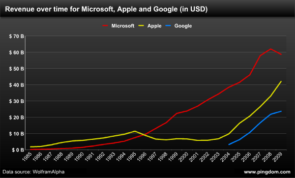
Now here’s an interesting observation: In the 1980s, Apple was a much bigger player than Microsoft in terms of revenue. Microsoft’s revenue didn’t pass Apple’s until the mid 1990s. However, look at how fast Apple’s revenue has been growing lately…
Then of course you have Google’s late but big-impact arrival (seen from its IPO in 2004). Google is a success that’s been pretty hard to miss, and here you can see the effect of that.
Now let’s look at the profits, which paint a different picture.
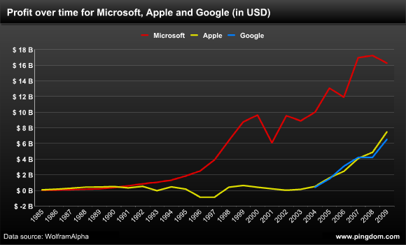
In terms of profit Apple was ahead of Microsoft in the 1980s, but was then passed and left behind. This chart actually reveals that Apple’s upswing the last few years is the first time the company’s profits have really taken off in a big way.
Another interesting observation is how closely the profits of Apple and Google match, even though Apple’s revenues are significantly higher. That’s impressive. Google, a company barely a decade old, is matching the profit of a company that not only has been around for a long time, but is now on a serious roll.
And then there’s the elephant in the room (almost literally). These charts show how Microsoft still towers over both Apple and Google when it comes to revenue and profit. Perhaps not so strange when you consider how big they are:
- Microsoft: 93,000 employees
- Apple: 36,800 employees
- Google: 19,835 employees
Now let’s examine each company a bit closer.
Yearly revenue vs. profit for Microsoft
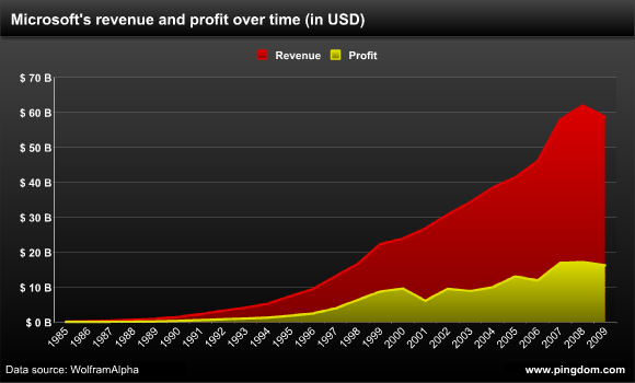
Say what you will about Microsoft, but they know how to make money, and lots of it. The company that made Bill Gates the richest man in the world has managed to stay profitable every single year since 1985 (which is when they went public and our numbers start).
Yearly revenue vs. profit for Apple
You can clearly see how Apple stumbled in the 1990s. The company was growing its revenue up until 1995, but profits didn’t really keep up and revenue started plummeting. Apple even started losing money for a while.
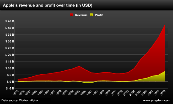
It’s no wonder Apple was desperate to get Steve Jobs back in 1997. Their revenues were going down, they were losing hundreds of millions of dollars. Apple needed to be saved. And now in retrospect we can see that after a few rough years, he did just that. Once Apple had gone through the initial fiddling with everything from introducing Mac OS X, switching to the Intel platform, and introducing the iPod, both revenue and profits started to soar. Apple is way bigger and way more successful now than the company has ever been.
Yearly revenue vs. profit for Google
Google’s graph shows how steadily the company has been growing. It’s been a model of profitability. Revenue has been rising rapidly, and so has profit.
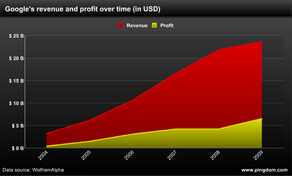
The remarkable part is what we commented on earlier in this article, that Google is keeping up with Apple’s recent success and matching that company’s profits year by year.
How much of the revenue is profit?
Another interesting thing to look at, and that is partly revealed by the revenue/profit graphs we’ve shown, is how much of the revenue becomes profit. Here are the numbers for 2009:
- Microsoft: 27.7%
- Apple: 17.8%
- Google: 27.6%
Google and Microsoft are really close here, at just under 28%. Apple with its 17.8% lags behind, but it’s getting better. Go back just five years (to 2004) and Apple’s profit was just 5.2% of its revenue.
Microsoft is quite impressive in that through all the years it’s never gone below 20%. Ok, one exception: in 1985, Microsoft’s profit was “only” 18.8% of the revenue. On the other hand, it’s also gone as high as 40.4% (in 2000).
Final words
These days we are so used of thinking of Apple as the David to Microsoft’s Goliath, so it’s interesting to look back at a time when the situation was actually the opposite. Microsoft was a much smaller company than Apple back in the 1980s, and it wasn’t really until after its success with Windows 3.1 and Windows 95 that the company really (really) started to approach its current Goliath status.
And consider this: Both Apple and Google have been growing their revenues and profits at a much faster rate than Microsoft the last few years. Is that a sign of things to come? Will Apple once more be a bigger company than Microsoft at some point in the future? Will Google?
Stranger things have happened.
Note: Apple’s IPO was all the way back in 1980. Microsoft on the other hand went public in 1986, and Google in 2004. In other words, the numbers we presented don’t go back to the absolute beginning of when these companies were founded. Just to be perfectly clear on that. 😉
And thank you WolframAlpha for making the data collection relatively painless.
