As we’re currently working on brand new Pingdom mobile apps for iPhone and Android phones, we’re going through the process of how to best create apps for multiple mobile platforms.
Should we stick to each platform’s guidelines or should we try to make the apps consistent in look and functionality between the platforms? Or, perhaps there is a third way, which only focuses on providing a great user experience.
Here are some of our thoughts on this.
There are no easy answers
Developing the same app for multiple mobile platforms, e.g. Android, iOS, etc., can be a daunting task. Platforms are different in terms of hardware, software, users’ expectations, and much more. Add to that the variation of specifications even within platforms, most notably Android fragmentation, and it’s a tall order to cover it all.

While developing the new Pingdom mobile apps, we’ve been going through the same process as many of you have, and we thought we’d share our experience so far and some of the decisions we’ve made.
Small differences for the user
From the user’s point of view, things can look deceptively similar between the platforms. If you pick up two smartphones from different platforms today, you could be excused for not immediately seeing that much difference between them. Disregard the branding on the outside; there are icons for you to tap on, things for you to slide across the screen, and other objects that fill up the device’s display.
Let’s look at a simple example, where the same functionality looks very similar in Android and iOS.
First, iPhone:

Then, Android:

Not that much difference between the platforms, but still, it’s not exactly the same.
But once you start digging into the details of how to build apps for the platforms, things quickly start to look very different.
Follow guidelines or innovate?
At the end of the day, when developing an app, the goal is not to follow guidelines, however good they are, but to build a great app for our customers.
Our view is that you should treat such guidelines as recommendations, and the starting point for your UX design process. There are, without a doubt, good things in guidelines and it’d be downright foolish not to learn from them.
Having said that, there are times when it’s better to opt for a solution that is the same on both platforms. Yes, even if that decision goes against the established guidelines for either or both platforms. While in other cases there are huge upsides in recommendations and conventions, simply because the user will recognize the behavior pattern and thus find the functionality easier to use.
Many of the innovations in this space derive from app creators, not from creators of the platforms. As app creators we are helping to push everything forward. In fact, sometimes we are obligated to do so. There are many fine examples of this that should be mentioned, but how about the significance of “pull to refresh” by Twitter?
Cross-platform mobile UX design – an example
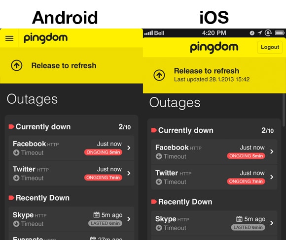
Let’s now look at one example. When working on the new Pingdom apps, we have decided to use pull to refresh in both iPhone and Android. Pull to refresh appeared first on the iOS platform, and although it’s made its way onto Android in various forms, it’s not become as popular on Google’s platform.
There are certainly those who would not agree with our decision, but our view is that it suits our apps very well. Particularly the common argument for pull to refresh, that it saves screen space, is one that we feel makes this UI pattern suitable for our apps. But at this point, we are still open for changing this decision.
Below you can see what it looks like when the pull is fully extended, and the user can let go to complete the refresh.
So what do you think?
We are still very early in our process, and we’re still evaluating the design and UI patterns as well as functionality and other details of our apps. But it’s safe to say that this is something that has already caused us much time in research and trying to figure out what will work for us. As we move forward, we hope to be able to report back to you with more articles.
Have you faced a similar issue in your mobile app developed? How do you approach this? Let us know, we’d love to hear from you.
Some of the guidelines that we have studied: Google’s guidelines for Android, Google’s Pure Android page, Apple’s iOS guidelines. Besides these there are plenty of great guidelines from others than the two main players, for example this one from Net Magazine.
