We have just released a new set of reports in the Pingdom control panel. These reports give you even more flexibility than before when viewing your uptime, downtime and response time monitoring results.
Note that these new reports are still in beta and will receive some additional polish, so this is the perfect time for you to come with feedback. Play around with them and let us know what you think by sending an email to support [at] Pingdom [dot] com.
The old reports are still available next to the new ones.
There are three new reports
- Overview report of all checks
- Uptime report for looking closer at individual checks
- Response time report for looking closer at individual checks
This post is just a very brief introduction to these three reports and what they offer.
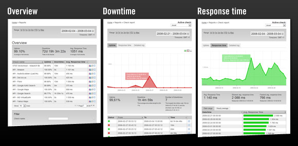
Adjustable time ranges in all reports
Common for all the new reports is that you can select a time period to view of 1 day, 1 week, 1 month, 3 months, 6 months, year to date (YTD) and also the max range, i.e. the entire period the check has been running. As if that wasn’t enough, there is even a “date picker”, so you can show any time range you like.

And another cool thing: selecting an area in a graph will zoom in to show that time period. 🙂
The overview report
This will help you when you want to get a quick overview of all your checks, or a selected group of checks.
The overview will show you the average uptime and response time for each check for the selected period (default is the last 30 days), as well as the amount of downtime during that period.

Above: The check overview table in the overview report.
You can sort the checks however you like (by check name, response time, etc), and you can even filter the checks to only show a selection of them.
The uptime report
Just as the name suggests, this report will let you have a (very) close look at the uptime history of your checks and see exactly when you have had downtime during the period you select to look at.
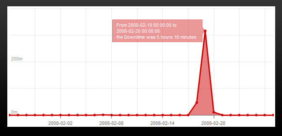
Above: The downtime graph in the uptime report (one of several elements in the report).
You will also be presented with a summary for the period you selected, showing the average uptime percentage, the total number of outages (downtimes), the longest and shortest outages, and so on.
The response time report
This report mimics the uptime report in many ways, but needless to say concerns itself with response time, not uptime. This is a great report for noticing performance trends. For example, does your site tend to be slow at peak visitor hours? Is your site slower now than it was a couple of months ago? It will be easy to find out using this report.
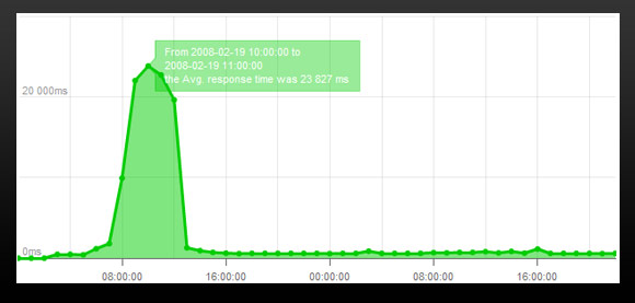
Above: The graph in the reponse time report (again, just one element of many on the report page).
You can even get a breakdown of the hourly response time averages for for the entire day for any period, which can be very helpful when trying to find bottlenecks. If your site slows to a crawl around 1 PM every day, this is definitely something you will want to know.
There’s a lot more
These new report have a lot of useful little details that will help you analyze your monitoring results, see trends in uptime and response time, and so on. To mention them all here in this little introductory post would be total overkill and make this more of a novella than a blog post.
Instead, if you have a Pingdom account, we suggest you log in to the control panel and have a look for yourself. Experiment and play around with them to your hearts’ content, and let us know what you think. We hope you like them, and would love to hear what you think.
P.S. If you don’t have a Pingdom account, please feel free to try out our free 30-day trial.
